- Getting Started
- Administration Guide
-
User Guide
- An Introduction to Wyn Enterprise
- Document Portal for End Users
- Data Governance and Modeling
- Working with Resources
- Working with Reports
-
Working with Dashboards
- Dashboard Designer
- Selecting a Dataset
- Data Attributes
- Dashboard Scenarios
- Dashboard Templates
- Component Templates
- 3D Scene
- Explorer
- Visualization Wizard
- Data Analysis and Interactivity
- Dashboard Appearance
- Preview Dashboard
- Export Dashboard
- Dashboard Lite Viewer
- Using Dashboard Designer
- Animating Dashboard Components
- Document Binder
- Dashboard Insights
- Add a New Page in Dashboard Designer
- View and Manage Documents
- Understanding Wyn Analytical Expressions
- Section 508 Compliance
- Subscribe to RSS Feed for Wyn Builds Site
- Developer Guide
Sunburst Chart
A Sunburst chart is also known as a multi-level pie chart. This chart is ideal for visualizing multi-level hierarchical data depicted by concentric circles. The circle in the center represents the root node surrounded by the rings representing different levels of hierarchy. Rings are divided based on their relationship with the parent slice, with each of them either divided equally or proportional to a value. This type of chart helps users in breaking down data into different entities for identifying and visualizing multilevel parent-child relationships in different business scenarios, quickly and efficiently.
Design a Sunburst Chart in Wyn Enterprise
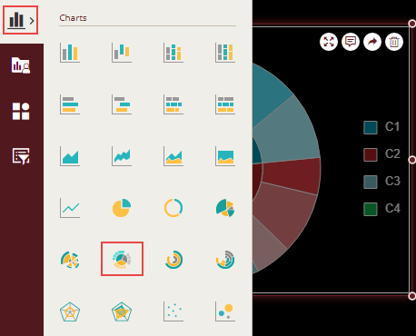
From the Dashboard Toolbox, open the Data Visualization node and drag-drop the Sunburst Chart scenario onto the design area.
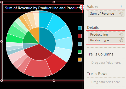
Bind Dataset to Chart Scenario
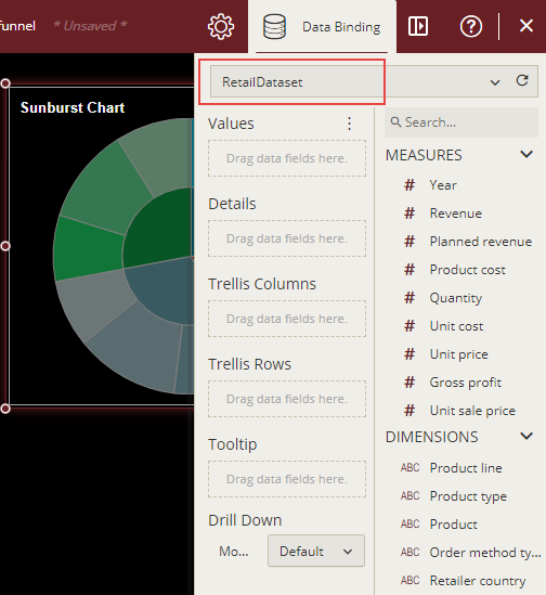
With the scenario selected, from the Data Binding tab, select the dataset. Once the dataset is successfully loaded in the designer, the data binding panel automatically expands and displays the data attributes available in the dataset.
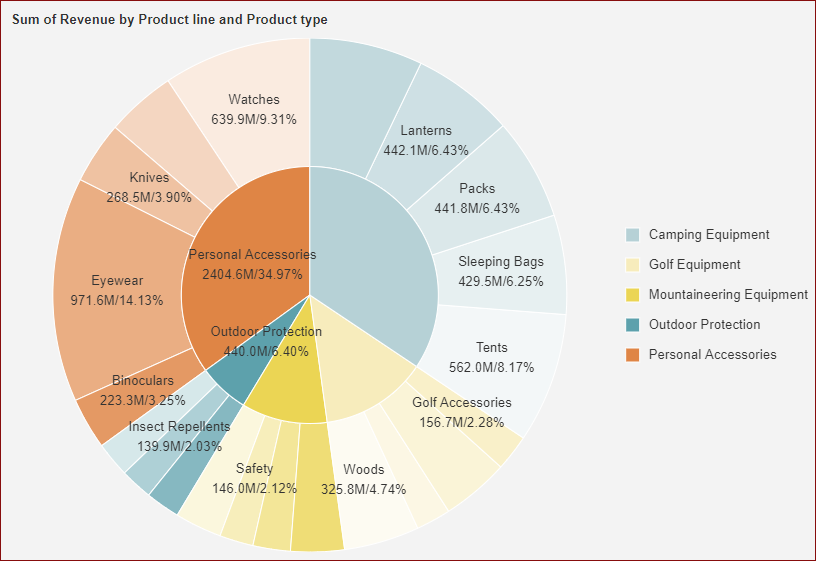
The following image shows the chart scenario bound to the 'RetailDataset' dataset.
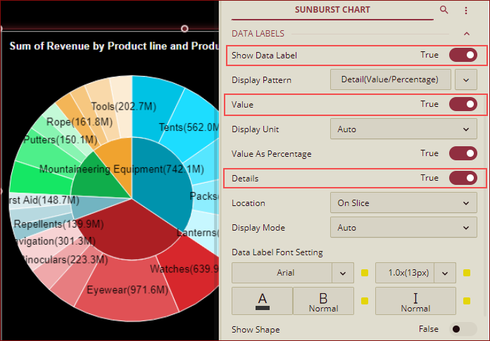
On dragging and dropping the data attributes to the data binding area of the scenario, the chart is plotted accordingly, with a default chart title on the design area.
By default, the data labels in the chart scenario are hidden. You can display the data labels in the scenario by setting the Show Data Label property to 'True', with the Value property set to 'True'. To show labels for data attribute bound to 'Details', set Details property to 'True'.
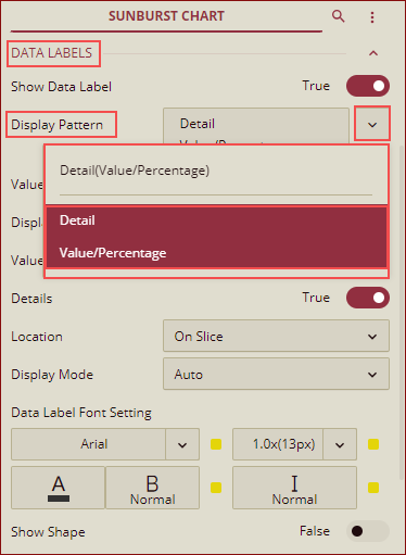
Data Labels - Display Pattern
The sunburst chart supports the line break in the data label, and you can add a line break between Value and Detail by using the Display Pattern property for the data labels as shown below.
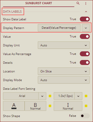
You can select any pattern from the dropdown list.
Preview the chart, the data labels will be shown as per the display pattern selected in the designer.
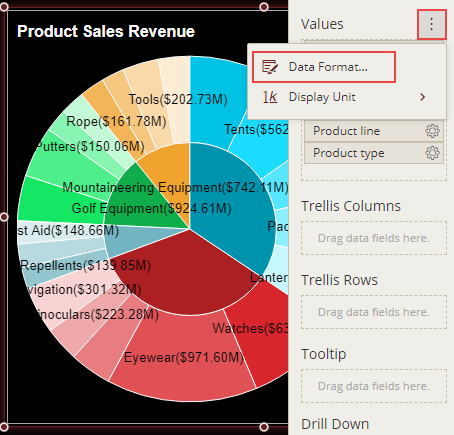
Format Data Attributes
You can format the data attributes and control the display of data by performing a variety of operations such as renaming, modifying data format and display unit, creating a hierarchy field, applying an aggregation method, etc. Using these operations, you can control the display of data attributes in a scenario.
For more information about these operations, see Data Attributes.
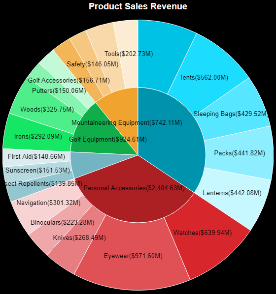
In the following image, the data format for the data attribute is modified to display the sales revenue in 'currency'.
Analyze Data
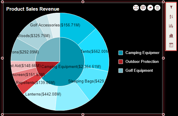
Wyn Dashboards scenarios support rich data analysis and exploration capabilities that can help analyze massive amounts of information and make data-driven decisions. For example, adding filters to scenarios, sorting data, applying conditional formatting, etc. Note that you can apply all these operations using the Action Bar corresponding to each scenario in the designer.
For more information, see Data Analysis and Interactivity in Dashboards.
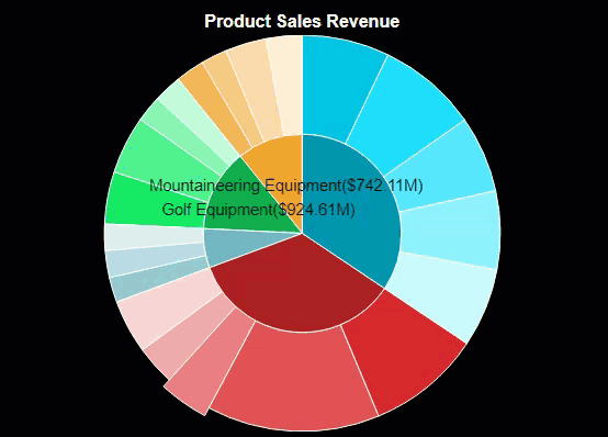
In the following chart scenario, the filter is applied to show data only for the selected product lines - camping equipment, outdoor protection, and golf equipment.
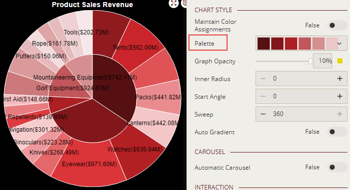
Customize Chart Appearance
You can customize the default chart appearance by setting properties in the Inspector tab of the scenario such as adding a border, modifying data labels, setting chart style, renaming chart title, etc.
Set Chart Style
Customize the chart colors in the scenario by using the Palette property in the Inspector tab. Set the property to a suitable color from the color palette.
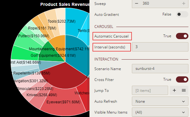
Enable Automatic Carousel
Enable the automatic carousel effect in the scenario by using the Automatic Carousel property to create a highly interactive and effective dashboard. The automatic carousel effect when enabled, highlights the chart slices one by one. You can specify the time interval for the automatic carousel by using the Interval (seconds) property.
You can see this effect when previewing the dashboard in the Dashboard Viewer.